In 2nd Century AD, Hellenic Cartographer Ptolemy was beset with an arbitrary choice of whether his maps should have north on the top or any other direction. Based in Alexandria, he reasoned that all population centers and places of importance lie to the north and would be convenient for study if they were in the upper right corner of the map. This arbitrary choice had long, unintended repercussions for mankind such as Australia being considered “Down under” or even our solar system to be perceived as rotating in counter-clockwise direction. Who would have thought that the stroke of a cartographer carried celestial importance!
Similarly, I am always fascinated about the distribution of population masses and economic activities across the globe and what sort of external signals gets influenced by this distribution. Flight routes in major airports would be one such signal. For instance, closer you get to north pole , most of your businesses will be facing south and vice versa. Or across the Atlantic, it would be interesting to note whether east-west trans-atlantic traffic volume dominates over domestic air traffic in America. I tried to visualize this flight path orientation across important airports in the globe. This post is partly inspired by another beautiful piece of visualization of street orientation of major cities across the world by Goef Boeing.
The Data and tools
The source data is from openflights.org. It contains over 67,000 routes between 3321 airports across the globe. It is not the most recent (their routes data source stopped providing updates since 2014), however it is enough to satiate our curiousity. For pre-processing, I chose to use Spark which is an overkill for such a small dataset. Spark is normally used for Big Data workloads where the data is too big to fit inside a single host. I thought this example would be a nice segue to using Spark for data transformations. Pandas and numpy were also used to bin the data before visualizing them on matplotlib.
wget -O /tmp/airports.dat https://raw.githubusercontent.com/jpatokal/openflights/master/data/airports.dat
wget -O /tmp/routes.dat https://raw.githubusercontent.com/jpatokal/openflights/master/data/routes.dat
Pre-processing data in Spark
Spark has two fundamental sets of APIs: the low-level unstructured RDD APIs, and the higher-level structured APIs which includes DataFrames and Spark SQL. Unlike the basic Spark RDD API, the structured APIs provide Spark with more information about the structure of the data and transformations. This allows it to take advantage of Spark’s optimizers such as Catalyst and Tungsten. For this reason, it is better to use the modern DataFrames API.
The Spark DataFrame API provides a convenient read function which can parse csv files and infer the schema on its own. However the source data doesn’t carry the header row and it is too tedious to rename columns once the dataframe has been created. It is far simpler to insert the header row before letting spark infer the schema.
sed -i '1s/^/airport_id,name,city,country,iata,icao,latitude,longitude,altitude,tz,dst,tz_olson,airport_type,data_source\n/' /tmp/airports.dat
sed -i '1s/^/airline,airline_id,src_airport,src_airport_id,dst_airport,dst_airport_id,codeshare,stops,equipment\n/' /tmp/routes.dat
table_names = ["routes","airports"]

for table_name in table_names:
    df = spark.read.load("file:///tmp/" + table_name +".dat",
                     format="csv", inferSchema="true", header="true")
    df.write.format("parquet").saveAsTable(table_name)

# Ignore broken rows and consider only direct flights
route_df = spark.read.table('routes')\
    .filter(col('stops') == 0)\
    .filter(col('dst_airport_id') != '\\N')\
    .filter(col('src_airport_id') != '\\N')
The next step to join the routes and airports table is seemingly trivial. However when we join airport table twice in Spark (once each for source airport and destination airport), the query planner gets confused on the join conditions (See SPARK-25150). To mitigate this, we create separate copies of dataframes for src_airport and dst_airport (although just one additional copy is sufficient to sort out the ambiguity).
src_airport_df = airport_df.select(
  'airport_id',
  'name',
  'city',
  'country',
  'latitude',
  'longitude'
).toDF(
  'src_airport_id',
  'src_airport_name',
  'src_city',
  'src_cntry',
  'src_lat',
  'src_lon')

dst_airport_df = airport_df.select(
  'airport_id',
  'city',
  'country',
  'latitude',
  'longitude'
).toDF(
  'dst_airport_id',
  'dst_city',
  'dst_cntry',
  'dst_lat',
  'dst_lon')

src_cond = [route_df.src_airport_id == src_airport_df.src_airport_id]
dst_cond = [route_df.dst_airport_id == dst_airport_df.dst_airport_id]

routes_airport_df = route_df.join(src_airport_df,
                          src_cond,
                          how='left')\
                        .join(dst_airport_df,
                          dst_cond,
                          how='left')\
                        .select('airline','src_airport','src_airport_name','dst_airport','src_city','src_cntry', 'src_lon', 'src_lat', 'dst_city','dst_cntry','dst_lon', 'dst_lat')

result_df = routes_airport_df\
.withColumn("delta_lon", routes_airport_df.dst_lon
            - routes_airport_df.src_lon
            - 360*(routes_airport_df.dst_lon
                   - routes_airport_df.src_lon > 180).cast("integer")
            + 360*(routes_airport_df.src_lon
                   - routes_airport_df.dst_lon > 180).cast("integer"))\
.withColumn("delta_lat",routes_airport_df.dst_lat - routes_airport_df.src_lat)\
.select('airline','src_airport','src_airport_name','dst_airport','src_city','src_cntry','dst_city','dst_cntry','src_lon','dst_lon','src_lat','dst_lat','delta_lon', 'delta_lat')
The additional arithmetic juggling in calculating the longitudinal distance is to ensure that we take the shortest distance between the points. If two points are more than 180 degrees apart, we can get the shorter path by adding or removing a full circle (360 degrees).
Note that for these calculations, we treat geographic co-ordinates as cartesian co-ordinates in Euclidean plane, with longitudes representing x-ticks and latitudes representing y-ticks- all of them equally spaced. This may not accurately represent the ground reality as earth’s surface is almost spherical and longitudes converges as we go towards the poles. The net effect is that the map gets stretched out at the poles. However this kind of representation(called Mercator projection) is not too uncommon and we will proceed to use it.
Next we calculate the relative bearing between the source and destination. In navigation, bearing is the direction to a destination point from a source point. We treated our geo co-ordinates as cartesian co-ordinates and x-axis is represented by the equator. So a bearing of zero would indicate east-bound direction and the angle grows counter-clockwise from east to west. Since we assumed Euclidean plane from the beginning, we can use atan2 function from popular computing to calculate the angle. Fortunately, spark also has a native implementation of atan2 function, or else we migt have had to create a UDF (User Defined Function).
The angle calculated using atan2 still doesn’t give the exact bearing between two points on earth’s surface. In fact, the actual bearing along a geodesic continuously changes further apart we are from the equator. Since we are visualizing earth’s surface as flat map, this difference is acceptable.
Visualizing
Visualization happens in the python process which means the data has to be succesfully transferred from the JVM universe of Spark to Python. In real world workcases, when we output to python we have to make sure that the transformed data from Spark can fit inside the memory of the Spark driver process. Since we aren’t encumbered by any such problems we can safely move the data to Python process (a pandas Dataframe). If the memory is really a bottleneck, we have to move some of the steps upstream (such as histogram binning) to spark UDF’s so that Pandas only works with aggregates.
import pandas as pd
import numpy as np
import matplotlib.pyplot as plt
pdDF = df_with_angle.toPandas()
For polar histogram, I have adopted the technique used by Jeff Boeing. Counting histogram bins based on linear axis can be misleading since 359° and 1° are treated as extremes whereas in polar co-ordinate they represent adjacent points. The solution is to create twice the number of bins desired and sum them pairwise, with bins around edges ([-175,0] and [0,175]) summed together.
def count_and_merge(n, bearings):
    ## make twice as many bins as desired, then merge them in pairs
    ## prevents bin-edge effects around common values like 0° and 90°
    bins = np.arange((-1)*n, n + 1) * 180 / n
    count, angles = np.histogram(bearings, bins=bins)

    ## move the last bin to the front, so eg 0.01° and 359.99° will be binned together
    count = np.roll(count, 1)

    return count[::2] + count[1::2], np.roll(angles[1::2],1)
def polar_plot(ax, bearings, n=36, title=''):
  bins = np.arange((-1)*n, n + 1) * 180 / n

  radii, division = count_and_merge(n, bearings)
  theta = np.deg2rad(division)
  width = (2*np.pi) / n

  ax.set_theta_zero_location("E")

  title_font = {'family':'Corbel', 'size':24, 'weight':'bold'}
  xtick_font = {'family':'Corbel', 'size':10, 'weight':'bold', 'alpha':1.0, 'zorder':3}

  ax.set_title(title.upper(), y=1.05, fontdict=title_font)

  ax.set_yticks(np.linspace(0, max(ax.get_ylim()), 5))
  yticklabels = ['{:.2f}'.format(y) for y in ax.get_yticks()]
  yticklabels[0] = ''
  ax.set_yticklabels(labels=yticklabels, fontdict=ytick_font)

  xticklabels = ['E', '', 'N', '', 'W', '', 'S', '']
  ax.set_xticklabels(labels=xticklabels, fontdict=xtick_font)
  ax.tick_params(axis='x', which='major', pad=-2)

  bars = ax.bar(theta, height=radii, width=width, align='center', bottom=0, zorder=2,
                  color='#003366', edgecolor='k', linewidth=0.5, alpha=0.7)
Conclusion
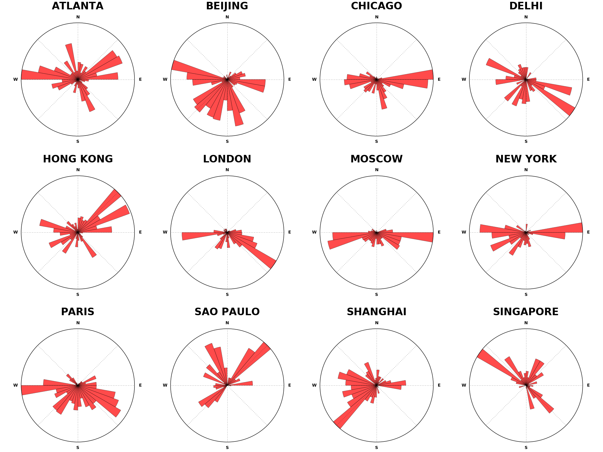
Here is the resultant plot. The most obvious pattern that we can observe is that northernmost cities have most of their routes pointing towards south. This is expected because our model of earth is flat and hence it precludes the possibility of any polar routes between two points (which may be the actual path taken by an aircraft). Also note that the absence of pacific-bound routes (towards americas) from chinese airports or the relative dominance of south-eastern routes from London and north-eastern routes from Hong Kong. Doesn’t it tell something about the current politico-economic climate of the world? I am sure the shipping routes will tell a different story though.